
JoltCocoa
A little bite. A big personality.
A playful chocolate identity with three distinct flavour personalities.
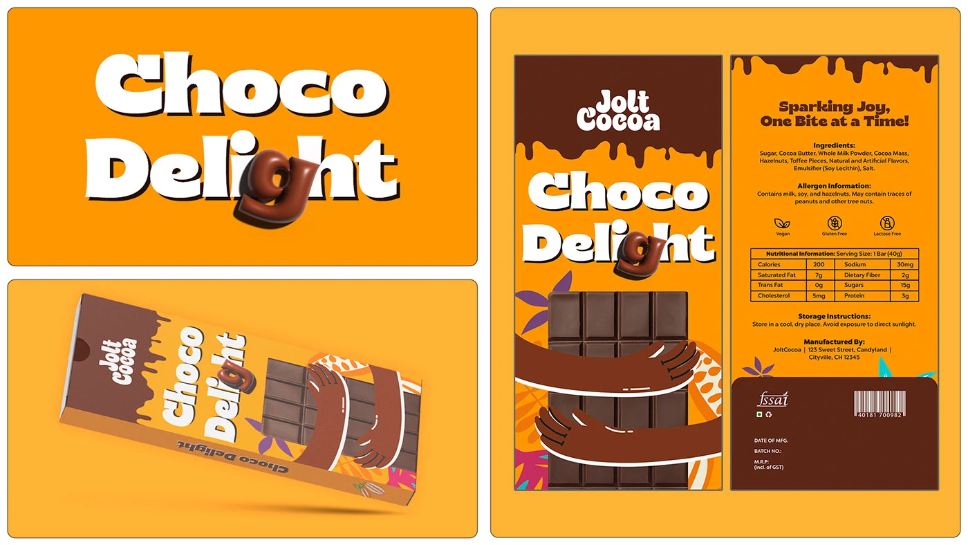
A little bite. A big personality.
The JoltCocoa brief asked for a logo, colour palette, typography and packaging for three flavours. The name expresses a burst of excitement, with the original concept aimed at a fun chocolate experience for children.
Turning the idea
into a system.
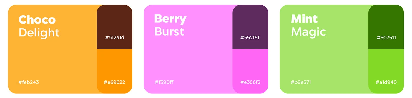
The visual system pairs bold, rounded lettering with playful dimensional details. Choco Delight uses orange and brown, Berry Burst uses pink and purple, and Mint Magic uses green. Each flavour has a clear colour identity within the same packaging structure.
The packaging places the flavour name prominently and wraps illustrated arms around a chocolate-bar visual. The repeated composition keeps the three packs recognisable as one family, while colour and flavour typography distinguish each variant.
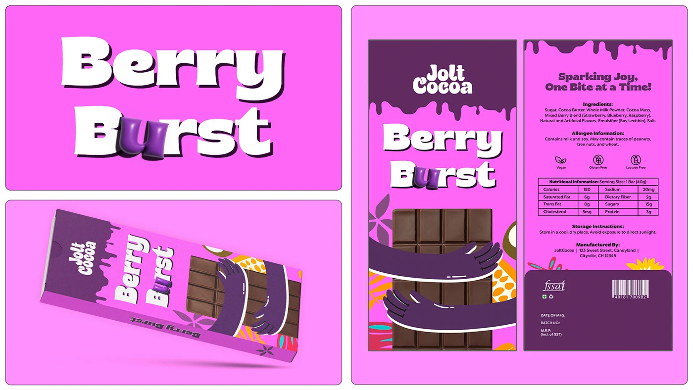

Summary based on the original Behance brief and artwork. Packaging is shown as a design presentation.
Let’s make your
next big thing.
From the first idea to the final detail.
Let’s make it unmistakably yours.